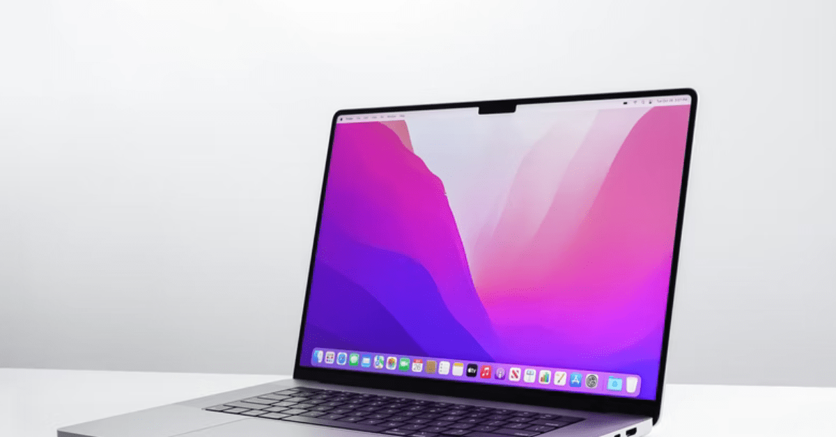
Everyone is aware of responsive web designs. A responsive and interactive design not only is a boost to the functionality of a website, rather it also makes it a delightful experience for the audience to navigate through your website more efficiently. Now there is something new that every website owner out there must give a try. I am talking about retina ready displays. In case you are building a new website with retina display or simply upgrading your old website, in both the cases you can benefit from the post below.

It is a known fact that retina display graphics are more effective in conveying the same message to the users as compared to the ordinary display graphics of a website. Below are the steps which can be used to make your website retina ready.
Make your website retina ready:
Probably the easier method to make your website retina ready is to create an image that is compatible with retina devices. This is a rather time- saving method in which you can later on feed this same image to non- retina devices as well.
Every modern web browser that we use today makes use of the bicubic resampling. These also do a commendable job with down sampling the images as well. It is a little known fact that almost every prominent web browser that we use today makes use of this bicubic resampling, including Google Chrome and Mozilla Firefox among others.
Depending on the web browser that you are using, there are two methods for down sampling the images for making them retina ready. The first one is to use the “img” tag and the second one is to use the CSS background images.
While using the “img” tag for rendering the retina- ready images, you will have the liberty to set the values for attributes such as height as well as width of the selected images. At this time, you will also have the choice to bring the resolution of the image to half of its actual value. For instance, you will be bringing the resolution to 400 * 600 while the actual resolution of the image was 800 * 1200 initially.
<imgsrc=”https://www.xyz.com/Retina-image-800×1200.png”width=”400″height=”600″>
On the other hand, in case you are using the CSS background images, you can use a CSS3 attribute, known as the “background size”. This attribute is of great use if you want to down sample the image so that it can be successfully used on all non- retina devices as well.
| <divclass=”imageChange”></div> | |
.imageChange {
background-image: url(Retina-image-800×1200.png);
background-size: 400px600px;
background-repeat: no-repeat;
display: block;
width: 400px;
height: 600px;
}
You can use following CSS media queries to serve Retina and non-Retina icon images –
| /* CSS for devices with normal screens */ |
.icons {
background-image: url(icon-sprite.png);
background-repeat: no-repeat;
}
/* CSS for high-resolution devices */
@media only screenand (-Webkit-min-device-pixel-ratio: 1.5),
only screenand (-moz-min-device-pixel-ratio: 1.5),
only screenand (-o-min-device-pixel-ratio: 3/2),
only screenand (min-device-pixel-ratio: 1.5) {
.icons {
background-image: url(icon-sprite-2x.png);
background-size: 200px100px;
background-repeat: no-repeat;
}
}
Once images are down- sampled, POLISH them
There may be times when you are not content and happy with the results of Photoshop down sampling. In situations like this, you can still go over the edge and hand- optimizes the image in order to bring it to the desired resolution. By doing this, you will be bringing the non- retina version of the image to better crisp results.
Texts, Strokes and Borders
Similar to the images on your website, you can also work wonders with the borders, texts as well as colours by making them retina ready.
Optimizing Image File Size
The most important factor which causes website response time is image size. Image size optimization can reduce up to 90% of image loading time hence faster website load time. There are many ways to do image optimization for retina ready images. The easiest way is using Photoshop “save for web” option. By goring further, there are many optimization tools like ImageAlpha which can 24bit PNGs to 8bit PNGs with alpha channel support.
Some Examples:
